Client's Objective:
Client wanted a website makeover. They felt the current design was dated.
Our approach:
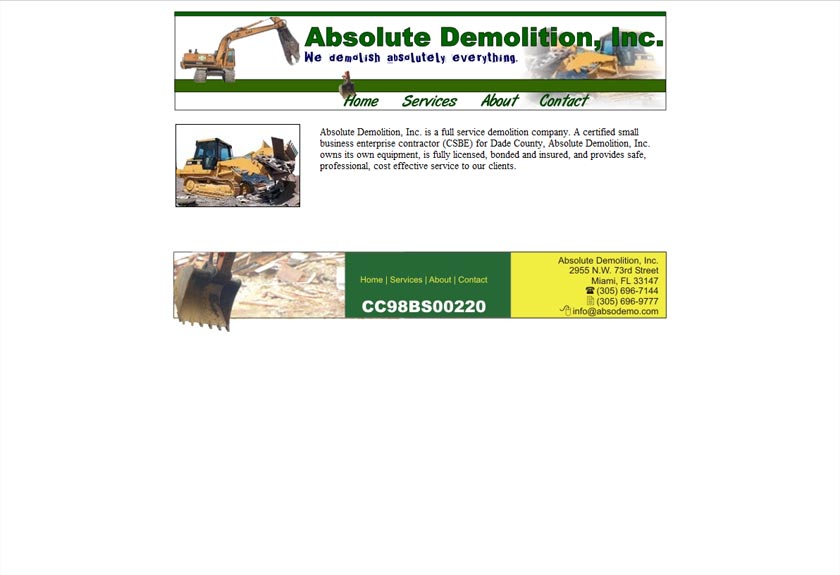
Absolute Demolition Inc.'s previous website had been built some time ago with a late 90’s early 2000 look and screen size resolution. The site was indeed dated, but very functional. We just needed to bring it up to today's standards and make it more SEO (Search Engine Optimization) friendly by using the latest title tags, meta descriptions and image alts.
We started by giving the company name, Absolute Demolition, Inc., a new prominent font with a gray, modern inserted look, and a large image shifting banner (known as a slider) to dynamically show the different services they offer. We chose an alternate blind transition for the slider to resemble a rock crunching machine.
They wanted the contact information to be easily available, not hidden under layers of buttons, so we built a visually prominent blue email link button and an always up Quick Quote Form.
The About Us section was written by the client and was perfect as is, concise and very descriptive of the services they offer. We accented the section with images representative of the text.
We chose different shades of grays and greens for a "construction-ish" color scheme and a cement tiled background giving the site a clean look and feel that makes the website pop.
The dark gray to green rollover buttons, as well as the recycling emblem, reflect the “green” aspect of their demolition services. We expect to eventually have 5 navigation buttons - Home, Services, Projects, Gallery and Reference.
This is a makeover in progress.


LOADING
Case
study